
Despite a significant rise in users, some dating apps continue to struggle with low retention rates 2. A survey revealed that users are often discouraged by dating apps that feel overwhelming and cluttered 1. We aimed to determine which type of navigation enhances user experience by reducing cognitive overload and increasing organization.
Identify the type of navigation that improves user experience by minimizing cognitive overload and enhancing overall organization.
Participants were presented with one of two different application experiences. One design featured a linear onboarding process with a single “continue” button, while the other used tabbed navigation to separate the onboarding sections.

Linear navigation as uni-directional button

Tabbed navigation requiring selection
We used a between-subject experimental design wherein a participant experiences one prototype selected at random. This design provided the following benefits:
Participants were interviewed over Zoom and given a standardized introduction to the study. They were asked to interact with a Figma medium-fidelity prototype as if it were a real dating application, despite the prototype's functional limitations. Screen and audio recordings were captured to document interactions with the user experience components.
After the onboarding experience, participants submitted demographic data, including age, device type, relationship status, and dating app usage history. Participants were also asked to recall features they noticed during the onboarding process and rate various aspects of their experience on a Likert scale.
Prototypes were developed in Figma, focusing on creating realistic user interactions to simulate the application experience. Although Figma does not support direct user input of information, we designed the prototype to autofill text fields upon user interaction, effectively mimicking the intended functionality.
The interface allowed users to “upload” photo, video, or voice recording; however, the system reflected state changes to indicate content was uploaded without actually processing the media files.
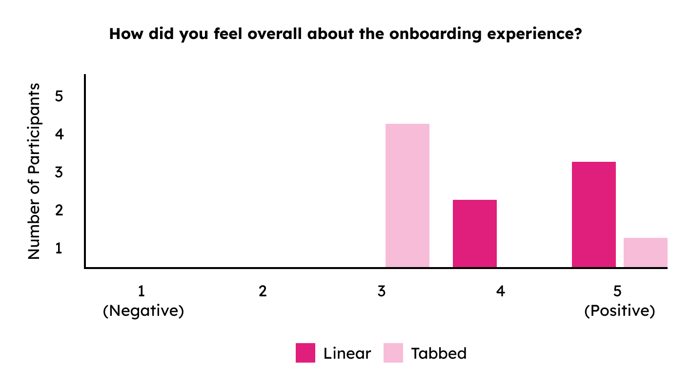
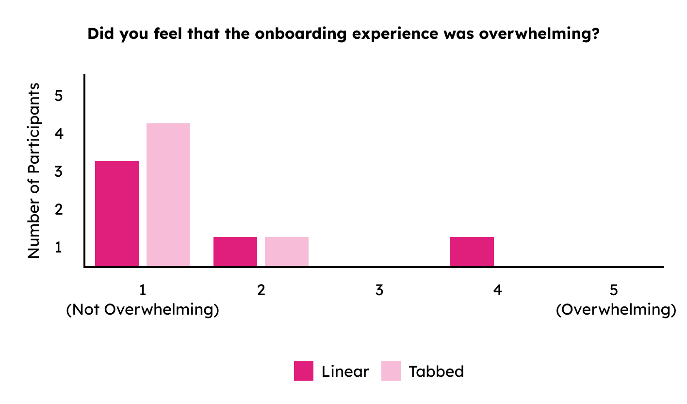
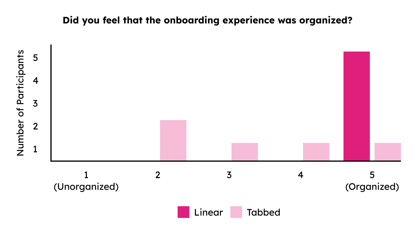
Histograms were used to visualize the overall feelings of participants and gauge their feelings of overwhelm or percieved organization. Feature recall data was converted to the number of features each participant remembered. Likert-scale data was quantified on a scale from 1 to 5, with 1 being the lowest and 5 being the highest level of intensity.
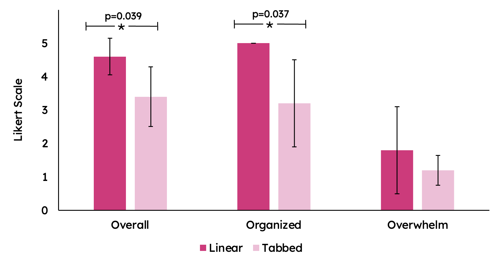
R-studio was used for statistical analysis, calculating measures of central tendency, variation, and performing t-tests.

Participants generally had a more positive overall onboarding experience with the linear prototype compared to the tabbed prototype. The average rating for overall likeability was 4.6 for the linear prototype and 3.4 for the tabbed prototype.

Both linear and tabbed prototypes were generally not perceived as overwhelming. Most participants rated the experience as not overwhelming (1) for both prototypes, with only a few participants feeling slightly overwhelmed.

The linear prototype was perceived as significantly more organized compared to the tabbed prototype. The majority of participants rated the linear experience as highly organized (5), whereas ratings for the tabbed experience varied more and were generally lower.

To test for statistical significance, the average Likert scale rating was compared between the two experiences.
Linear onboarding was perceived as more organized and positive compared to tabbed onboarding. No significant difference in cognitive overwhelm or feature recall between the two prototypes. Time taken to complete onboarding did not differ significantly between the prototypes.
Participants were more satisfied overall with the linear onboarding experience
They also found a linear navigation more organized, but there was
no significant difference in their experiences with cognitive overwhelm. There was no significant difference in the number of features recalled by the participants,
suggesting that both navigation structures allowed participants to note and remember important features.
Additionally, the time to complete the experience did not vary significantly between experiences, indicating further that cognitive overwhelm did not influence the
experience of participants. Further research could explore a hybrid model of both linear and tabbed experiences and the role of AI in improving onboarding.
1Julia Harding, Prajyot Meshram, and Shafizur Rahman Seeam. 2024. Features from Online Dating Apps that Impact User Engagement and Satisfaction. Rochester Institute of Technology, Rochester, NY, USA.
2Douglas Zytko, Sukeshini A. Grandhi, and Quentin Jones. 2014. Impression Management Struggles in Online Dating. In Proceedings of the 2014 ACM International Conference on Supporting Group Work (GROUP '14). Association for Computing Machinery, New York, NY, USA, 53–62. https://doi.org/10.1145/2660398.