The South Lyon Community Cardio Drumming group, a non-profit fitness organization, aims to broaden its online presence by transitioning from relying solely on Facebook to establishing a fully functional website.
The design documentation encompasses a style guide, user personas, competitive analysis, and a sitemap, all aimed at benefiting both the client and the developers. Additionally, wireframes, mockups, and UI examples are provided to support site development.
Develop a comprehensive understanding of the brand and its target audience to establish clear design standards for developers and provide the client with strategic content and branding recommendations.
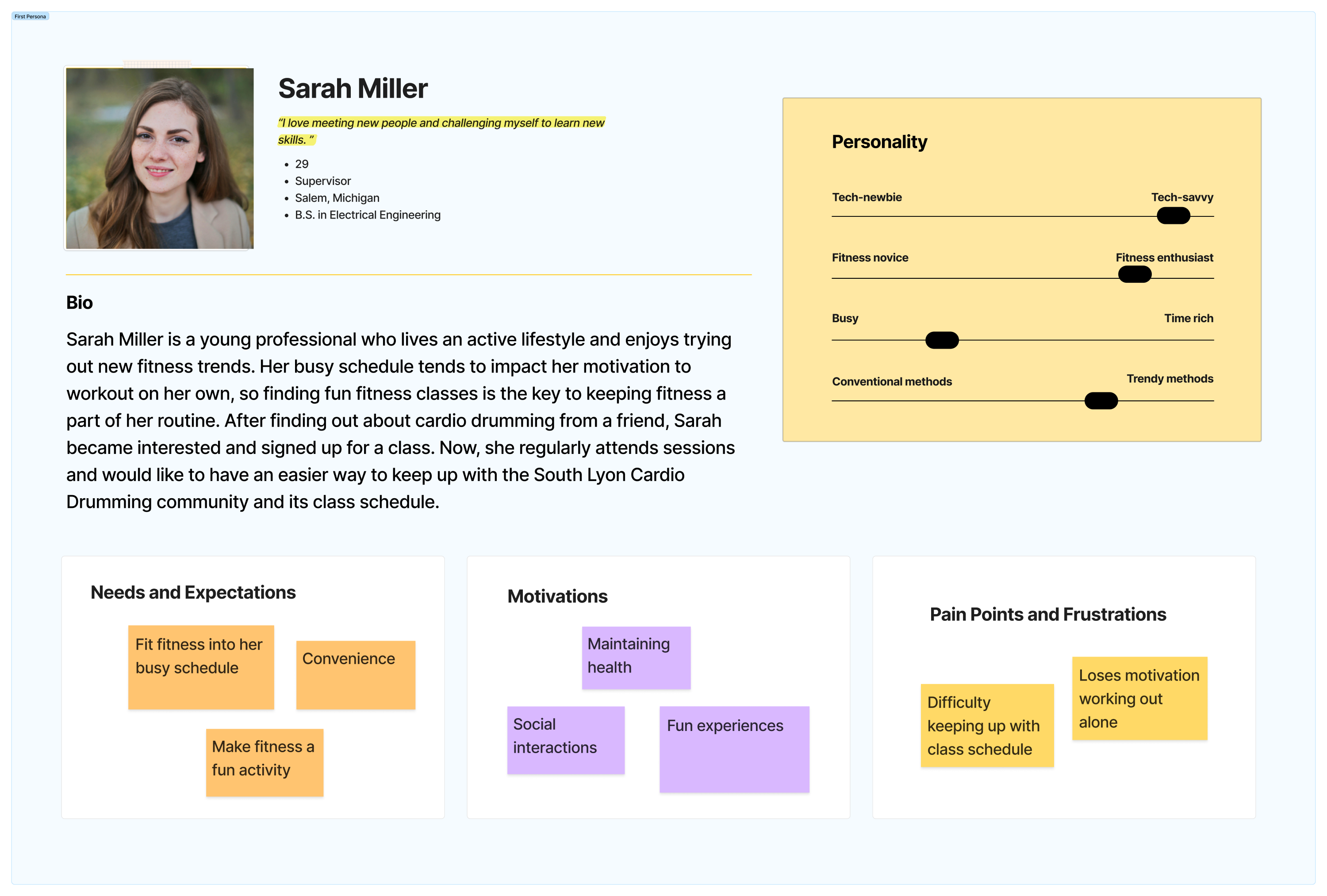
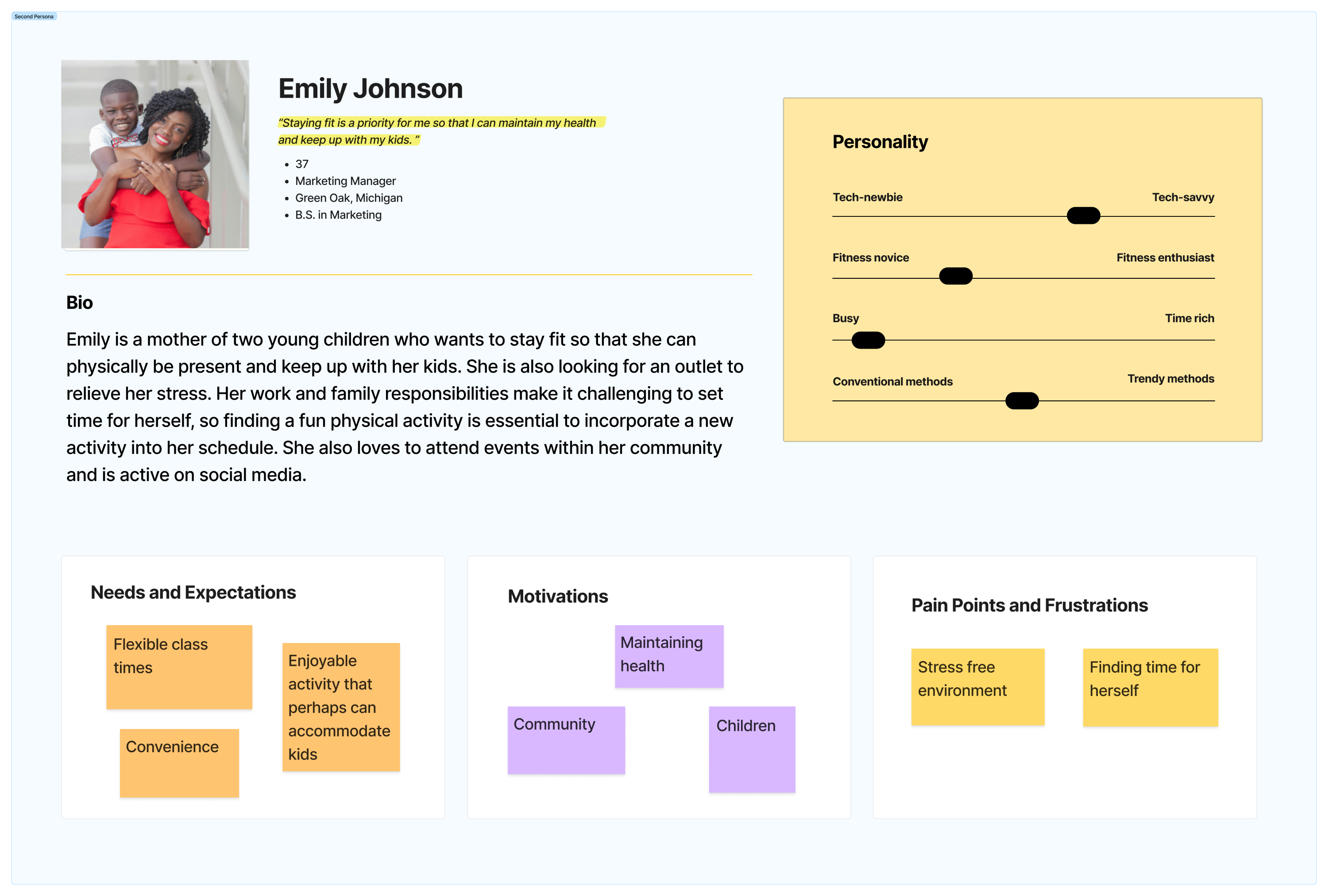
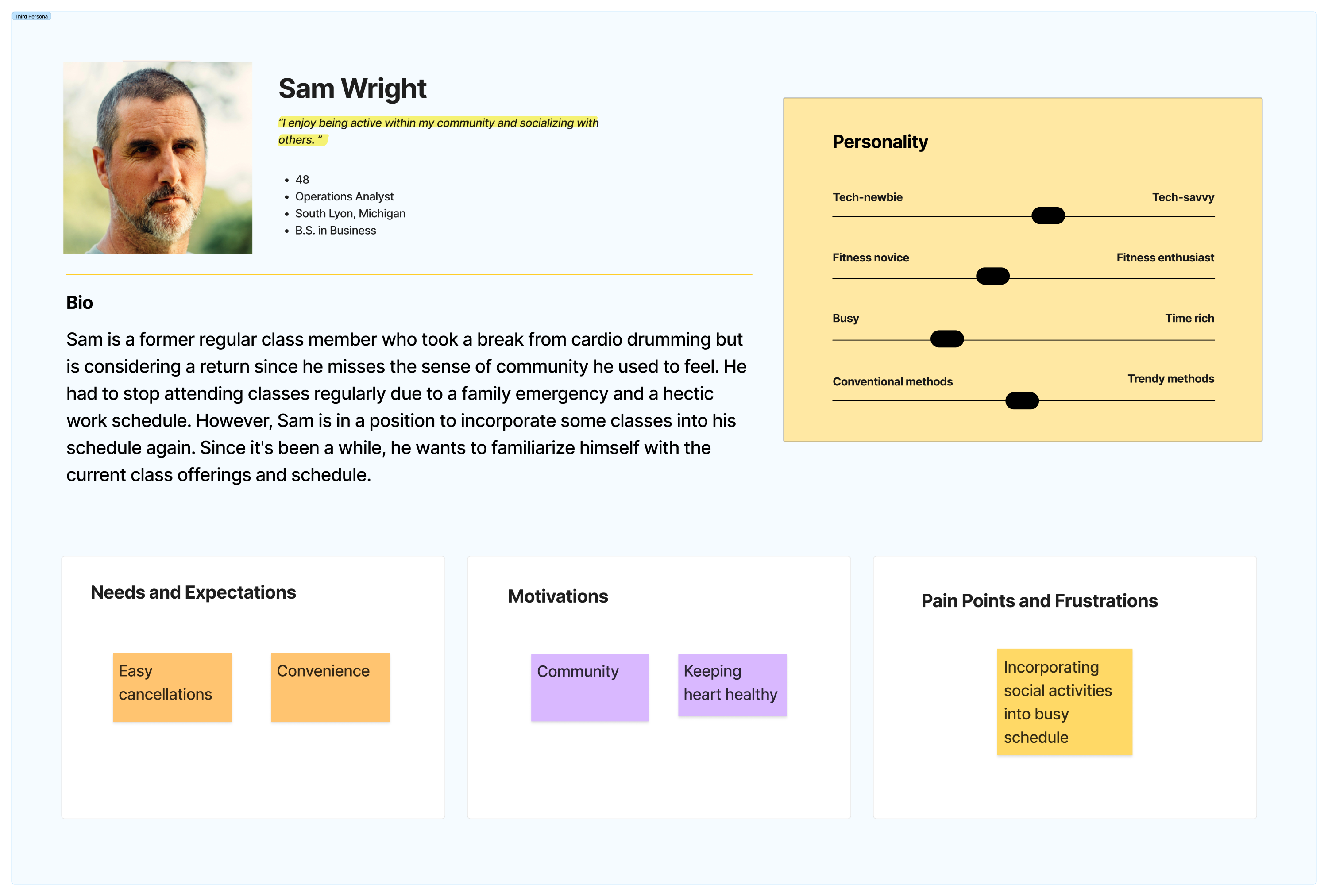
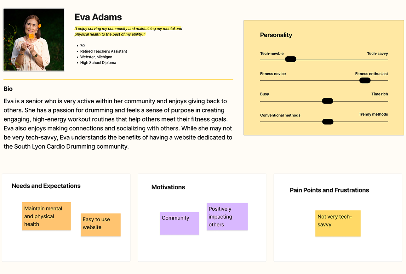
After consulting with the client, we learned that the member base consists of a wide range of individuals varying in age, gender, and educational backgrounds. To ensure our design meets the diverse needs of this community, we created four personas to guide the ideation process.
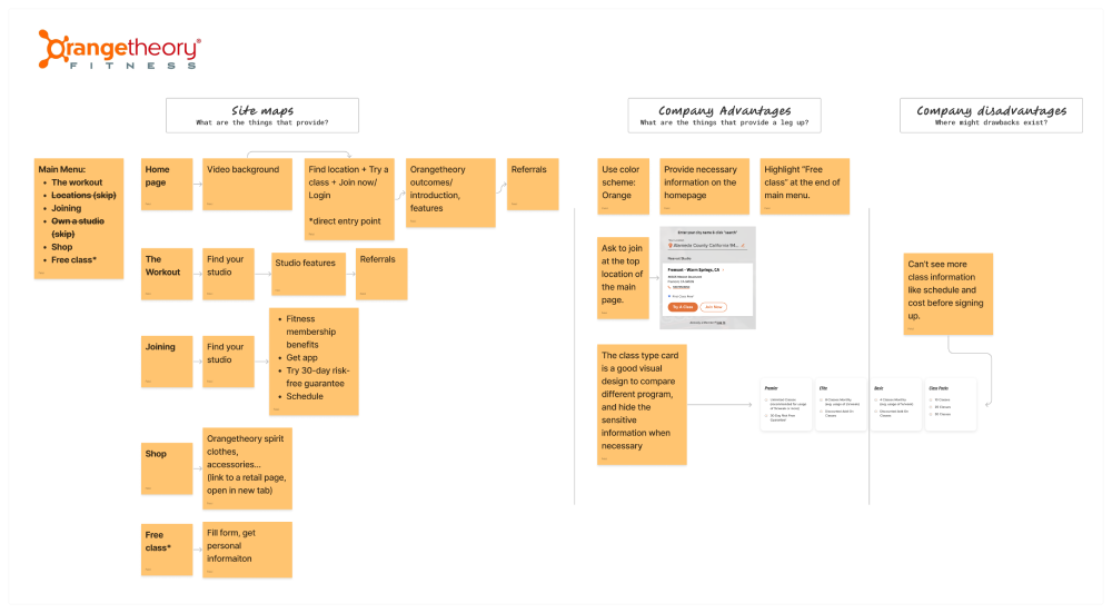
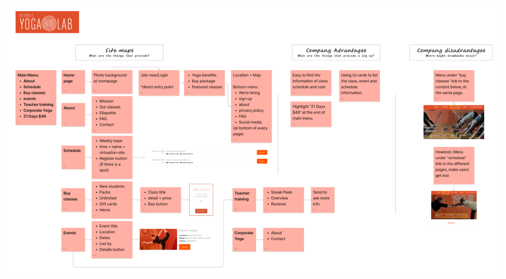
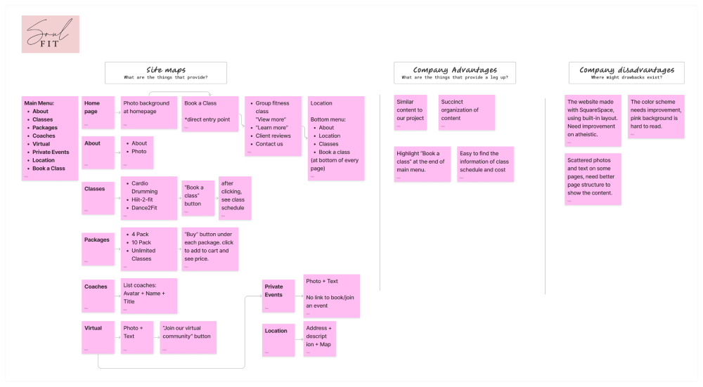
We performed competitive analysis of fitness websites Orange Theory and Yoga Lab and another cardio drumming organization Soul Fit to provide us with inspiration with their strength and ideas for areas of improvement from their weaknesses.
The style guide was inspired by the existing Facebook page, merging observed style preferences, such as bright colors and a fun, approachable tone, with accessible design standards to enhance usability. This approach ensures a seamless transition for existing users while creating a cohesive and inclusive experience across both platforms.
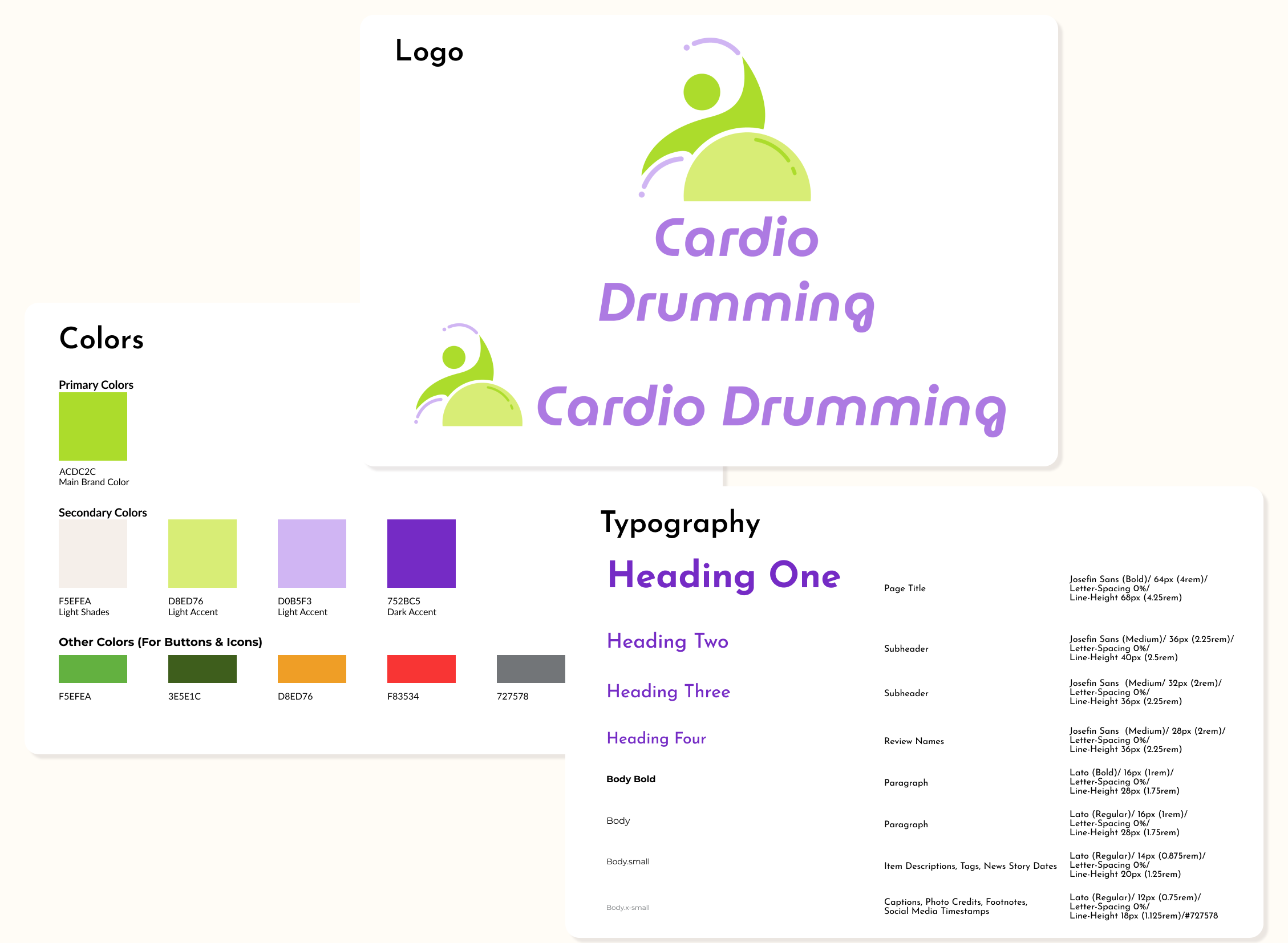
The logo highlights the two essential elements of cardio drumming — drumsticks and a yoga ball. It incorporates simple colors that align with the website’s color scheme for a cohesive visual identity.
Bright and energetic purple and green were selected to evoke a sense of fun and excitement, reflecting the active nature of cardio drumming. These complementary colors create a vibrant contrast that enhances visual interest and balance. Contrast ratios were ensured to be WCAG AAA compliant.
The headings font, Josefin Sans, was chosen for its clean, modern look and geometric style to provide a playful feel. The rounded, friendly letterforms convey approachability, making the site inviting for a wide range of users. The body font, Lato, was selected for its balance between readability while maintaining warmth and playfulness. While body text is typically serif, we agreed the minimal use of large text blocks made it worthwhile to prioritize a modern and inviting aesthetic.
The navigation style was designed to be simple and intuitive, inspired by insights from our competitive analysis of similar fitness websites like Orange Theory and Soul Fit. The primary navigation bar remains simple and uncluttered, highlighting key sections such as “Home,” “About,” and “Schedule” to ensure users can quickly access essential information. Dropdown menus for lesser-accessed pages, such as “FAQ” and “Leads,” help maintain a streamlined look while offering additional resources without overwhelming the user.
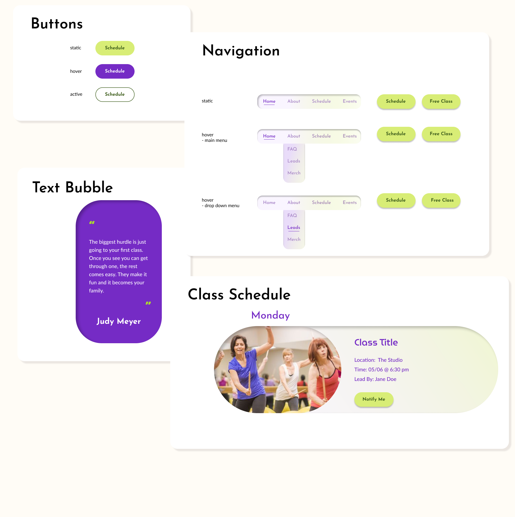
The prominent call-to-action buttons (“Schedule” and “Free Class”) were strategically placed and styled in vibrant green to draw attention, making it easy for users to check the class schedule or draw in new members with a risk-free trial. This approach not only improves usability but also aligns with best practices observed in competitor sites, which emphasize clear navigation and accessible booking options. By balancing simplicity with functionality, the navigation design ensures a smooth and engaging user experience.
The button colors were chosen to improve visibility, provide clear interaction feedback, and maintain consistency with the vibrant website design. The static green button highlights key actions, while the purple hover state creates a noticeable contrast when the user selects the button. The outlined green active state offers a clear visual indicator of the current selection, helping users easily recognize their location within the interface.
Cardio drumming’s greatest strength is its open, inclusive, and non-judgmental approach to fitness, making it essential for beginners to feel welcomed. To encourage newcomers, the website will prominently feature participant testimonials in text bubbles styled to reflect the community’s friendly atmosphere. The rounded corners and vibrant purple color create a warm, approachable look, while the contrasting white text ensures readability. Including the reviewer’s name adds authenticity, helping to inspire others to join.
The class schedule design emphasizes clarity, ease of use, and engagement. Prominent day headers help users quickly find classes, while the rounded participant image reinforces community and inclusivity. Key details like location, time, and instructor are clearly displayed for quick reference, and the bright “Notify Me” button encourages users to set reminders. The rounded edges and vibrant colors create a friendly, approachable feel, consistent with the website’s energetic tone.
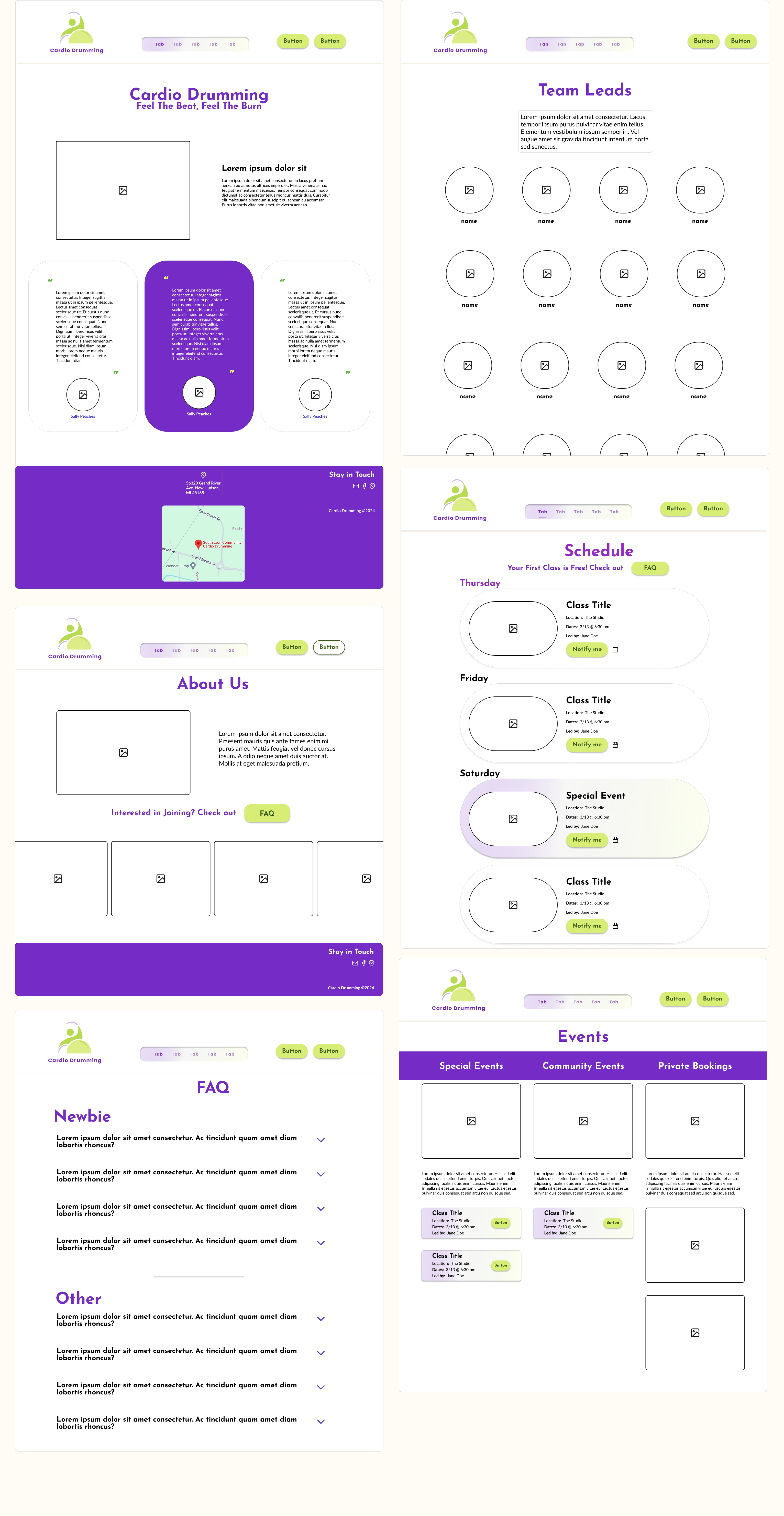
The wireframe is designed to serve all users, with several key features specifically to support new members. The “Stay in Touch” section and map location in the footer of every page ensure quick access to essential contact information and the venue, making it easy for newcomers to get involved. The event section with “Notify Me” buttons simplifies event participation, while the dropdowns in "FAQ" provide instant answers to common questions without overwhelming users with large amounts of text. A photo-centric design minimizes reliance on heavy text, creating an approachable and visually engaging experience for both new and returning members. Together, these features ensure a seamless, welcoming platform that supports user engagement at all levels.
The project was fully developed using PHP and integrated with GetSimple CMS to provide the client with a user-friendly content management solution. Please note that my website does not support hosting PHP-based applications. The live link is below.